Report Builder Updates: September 2026
Trellis charts, base sizes in legends, AI Insights and editable category labels, plus a first look at our new PowerPoint add-in.
.png)
TL;DR: What's new in September 2026
- Trellis charts: Split your data into a set of linked bar charts from a single chart placeholder.
- Base sizes in legends: Show sample sizes next to each legend item, in a format you choose.
- AI Insights: Generate key facts from any slide in one click.
- Export category labels: Replace standard chart labels with editable text boxes.
- PowerPoint add-in (preview): Quick actions for significance testing, logo labels, formatting and more.
September was a big release. We added a new chart type, more control over how bases are shown, our first AI feature and a new way to export category labels. We also gave a first look at our new PowerPoint add-in.
We walked through everything in a live webinar. You can watch the full recording below, or read on for a summary.
Trellis charts
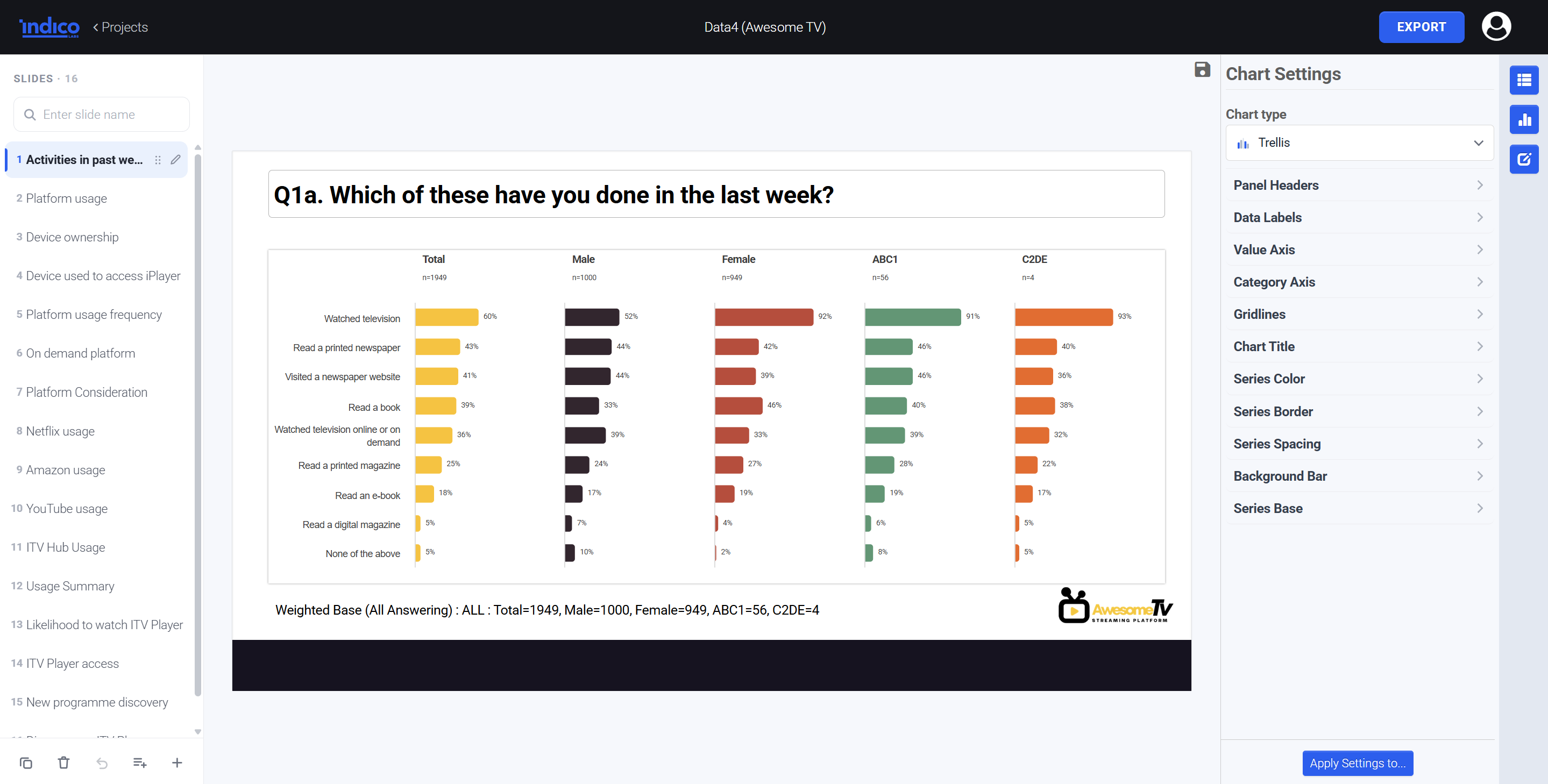
Showing the same question across several groups (for example Total, Male and Female) used to mean setting up separate bar charts in separate placeholders. You'd hide the category axis on all but one, line them up, and if you wanted to add another group, you'd need a whole new layout.
Trellis charts remove all of that. Select the columns you want from your data table, choose the Trellis chart option, and Report Builder splits them into evenly spaced, neatly aligned bar charts, one per group.
- Only one placeholder needed. Your template just needs a single chart placeholder, however many groups you show.
- All charts are linked. Sort the data or change a chart setting, and every chart in the trellis follows.
- Add or remove groups freely. No need to switch layouts when your columns change.
Base sizes in legends
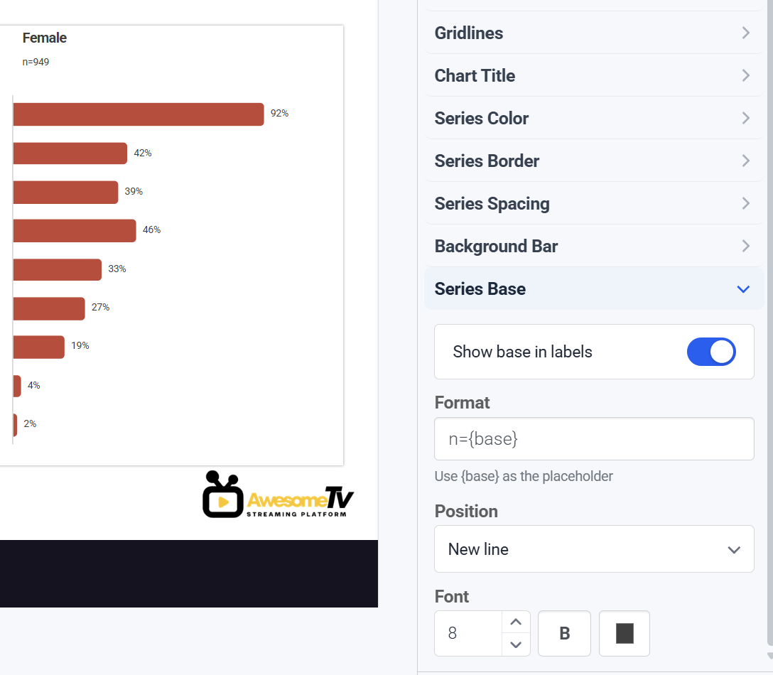
You can now add sample sizes directly to each legend item, so readers can see the base for every group at a glance.
You decide the format using the {base} tag, which is replaced with the actual number. For example:
- n={base} shows as n=1000
- n=({base}) shows as n=(1000)
- Base: {base} shows as Base: 1000
Set it on an individual chart, or add it to your global settings to make it the default for specific chart types.
AI Insights
AI Insights gives you a head start on your commentary. Select a slide, click Generate AI Insights, and Report Builder pulls out the strongest facts from the data. You can then copy them straight into your slide.
This is an early version, and we want your help shaping it. If you'd like to try AI Insights and tell us how it should work for your team, contact our support team at support@indicolabs.io and we'll switch it on for your account.
Export category labels
On bar charts, you can now replace the standard PowerPoint category labels with editable text boxes. This gives you more freedom to position, style and edit labels once your report is in PowerPoint.
First look: the Indico Labs PowerPoint add-in
Alongside Report Builder, we're building a separate PowerPoint add-in with Quick Actions: one-click tools for the formatting jobs that eat up time at the end of a project. It works on both PC and Mac.
Available now:
- Significance testing: Run significance testing directly on tables.
- Logos on charts: Swap standard chart labels for brand logos automatically.
- Clean formatting: Hide data labels below a set threshold, such as under 3%.
- Table formatting: Apply conditional formatting rules to tables.
- Colour control: Apply custom series palettes and match data label colours to bar fills.
Coming soon:
- Significance testing directly on charts
- Sorting for chart and table data
- Heatmaps on tables
- Auto-positioning of data labels to stop overlap
- Find and replace for chart elements
- Percentage point difference calculations
- Automatic colour mapping by brand or category
We're also happy to look at building specific functions your team needs.
Request early access to the PowerPoint add-in
Tell us what's missing
Many of our updates start with a request from a user. If there's a feature that would make your reporting much easier, email support@indicolabs.io with your idea.
New to Report Builder? It turns your data tables into editable slides in seconds. Book a demo to see it in action.
.png)