Report Builder Updates: October 2026
Conditional formatting for data tables, slide sections, custom chart markers and simpler significance testing labels. See what's new in Report Builder.

TL;DR: What's new in October 2026
- Conditional formatting: Set rules to colour cells and fonts based on their values, across all slides.
- Slide sections: Group slides into named, collapsible sections, just like PowerPoint.
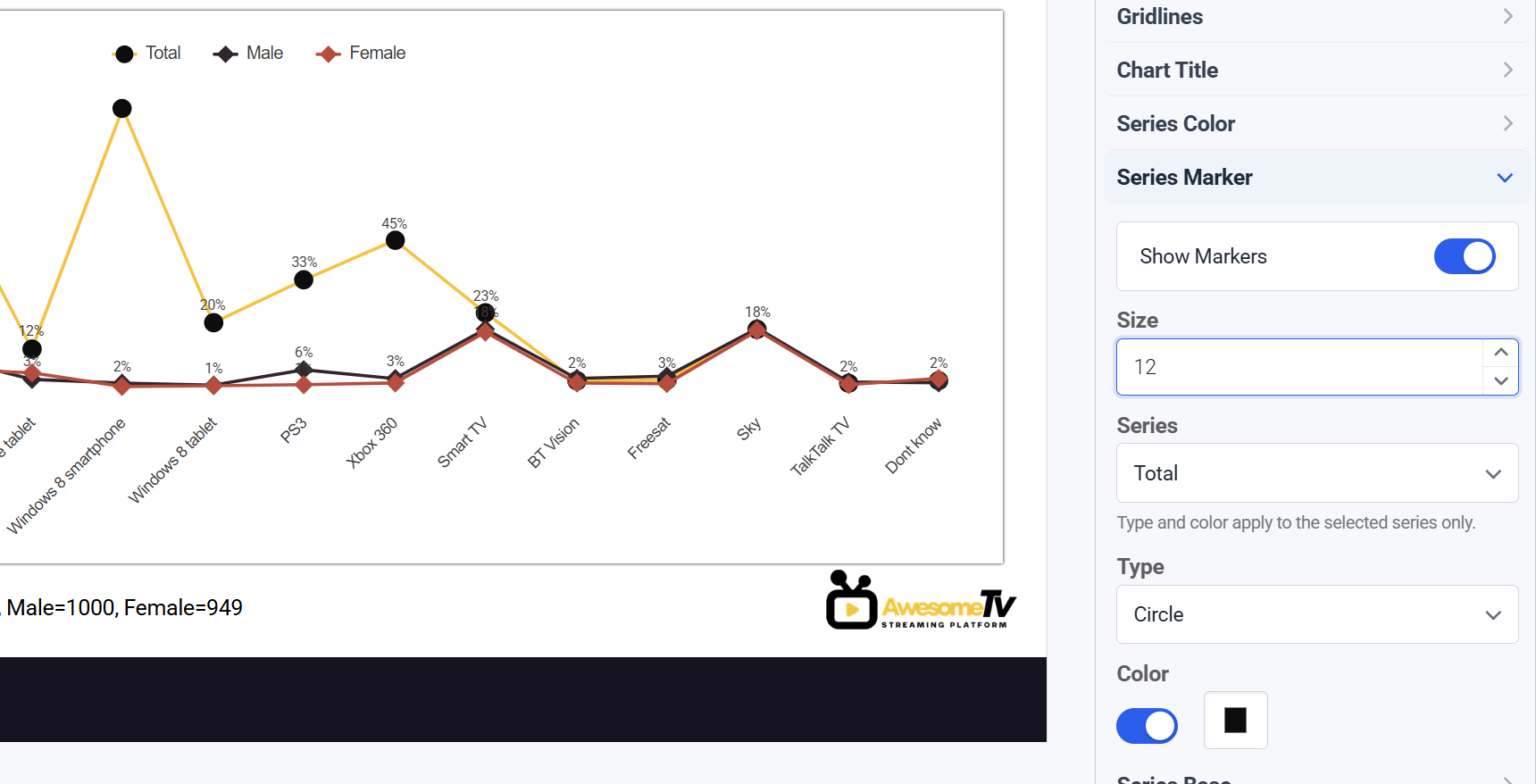
- Series markers: Choose a marker shape and colour for each series on line and radar charts.
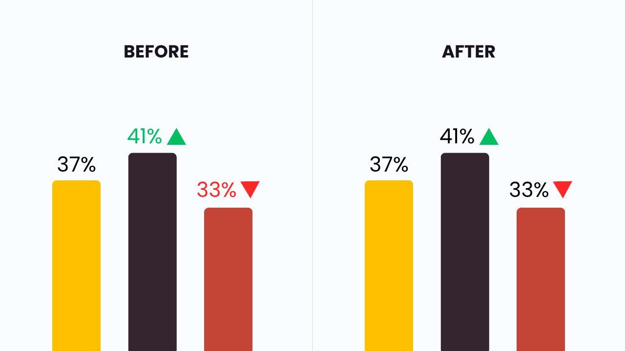
- Significance testing labels: Significant differences now show an arrow only, with no change to label colour.
- UI clean-up: A refreshed look across the platform.
This release brings two new features to Report Builder: conditional formatting for data tables and slide sections. We've also added more control over chart markers, simplified significance testing labels and given the whole platform a refresh.
Here's what's new and how it helps.
Conditional formatting for data tables
Spotting key results in a large data table takes time, and colouring cells by hand takes even longer. Conditional formatting does it for you.
You can now set rules that change cell colour and font colour based on the values in your tables. For example, turn cells red when a score is negative, or green when it passes a target.
With conditional formatting, you can:
- Create rules based on the values in your tables.
- Choose cell colour and font colour for each rule.
- Apply multiple conditions to the same table.
- Apply your settings to all slides in one go.
Your formatting carries through to your PowerPoint download and DashBox, so key findings stand out for your clients with no manual work.
Slide sections
Large reports often include slides you don't need right now but don't want to delete. Slide sections let you keep them without the clutter.
Slide sections work just like sections in PowerPoint. You can:
- Add a section and give it a name.
- Group slides into collapsible sections.
- Reorder slides and sections.
- Hide slides from view without deleting them.
Sections carry through to your PowerPoint download and DashBox, giving your clients a clearly structured deliverable.
Other improvements
Series markers for line and radar charts
You now have full control over the markers on line and radar charts. Select any series and choose its marker shape (circle, square, diamond and more) and colour. Each series can have its own settings, making it easier to tell lines apart and match your brand guidelines.
Simpler significance testing labels
When significance testing against a control group, next point or previous point, a significant difference used to add an arrow and colour the data label green or red. Now, only the arrow is added and your data labels keep their original colour. Your charts stay consistent with your template while still showing what's significant.
General UI clean-up
We've refreshed the look of the whole platform, with small improvements throughout. Report Builder should feel cleaner and easier to use.
Tell us what's missing
Many of our updates start with a request from a user. If there's a feature that would make your reporting much easier, we want to hear about it. Email support@indicolabs.io with your idea.
New to Report Builder? It turns your data tables into editable slides in seconds. Book a demo to see it in action.
.jpg)