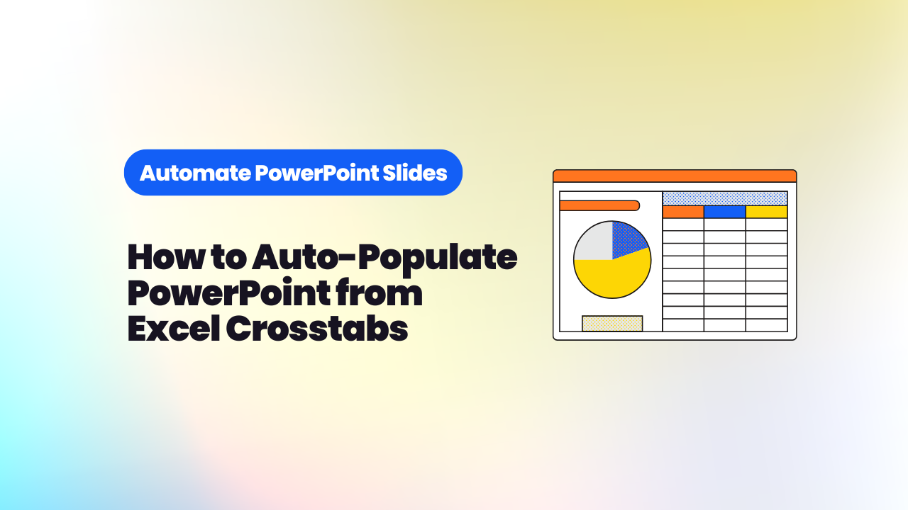
How to Auto-Populate PowerPoint from Excel Crosstabs and Survey Data
Stop copying data from Excel into PowerPoint by hand. This guide covers two approaches to auto-populate PowerPoint from survey crosstabs: Report Builder for new decks, and SlideGen for refreshing existing templates.
TL;DR: If you work in quantitative market research, you don't need to copy data from Excel into PowerPoint by hand. This guide covers two approaches to automate reports in PowerPoint from your survey crosstabs: Report Builder, which generates new branded slides from scratch, and SlideGen, which repopulates and repeats existing report templates. We cover how each works, when to use which, and what you can realistically expect to produce in minutes.
Fieldwork is done. Data is processed. Your crosstabs are sitting in Excel, ready to go.
For a lot of researchers, what comes next is actually fine. Opening PowerPoint, working through the tables, building each chart. There's something methodical about it. You're close to the data, you spot things, you start forming a view.
But here's the reality: it's slow. And no matter how carefully you work, it's open to human error. A misplaced figure, a label that didn't update, a percentage that's one column off. The QA burden alone can eat as much time as the charting itself.
There's also a client reality that doesn't always get said out loud: sometimes they just want everything charted. Not a curated, story-led presentation. Just the full data, cleanly visualised, quickly. And when that's the brief, spending two days on manual population is hard to justify.
That's where automating reports in PowerPoint from your survey data starts to make a lot of sense. Your time is worth more than copying and pasting data from Excel to PowerPoint.
What does "auto-populate PowerPoint from survey data" actually mean?
Auto-populating PowerPoint from survey data means uploading your processed crosstabs to a piece of software, which then reads your question text, rows, columns, and sample information, and uses that to either generate slides or populate an existing report template. You get an editable PowerPoint deck at the end, without the manual copying in between.
It's not magic, and it doesn't replace the analysis. What it removes is the manual work between having your data ready in Excel and having it in PowerPoint. That part alone can take hours on a typical project.
What format does your data need to be in?
For both tools covered in this guide, your data needs to be formatted as Excel crosstabs (sometimes called banner tables). These are the processed output files you'd typically receive from a data processing team or generate from your survey platform.
The software reads each table automatically. It works out where the question text sits, where the rows and columns are, and where the sample sizes appear. You don't need to reformat your files or follow a special template. If your crosstabs look the way they normally do after processing, you're ready to go.
Two ways to go from crosstabs to PowerPoint
The right approach depends on what you're starting with.
If you're building a new deck from scratch, Report Builder is the tool for you. It reads your crosstabs, pulls in your PowerPoint template (or your client's), and generates a complete set of branded slides automatically. One slide per question, in your fonts, colours, and layouts.
If you already have a designed report template and want to push new data through it, SlideGen is the better fit. You upload the existing PowerPoint, map your data to the slides using a point-and-click interface, and let SlideGen repopulate or repeat the slides with the new figures.
Both handle the PowerPoint report automation use cases you're most likely to encounter in quantitative research. The key difference is whether you're creating slides or refreshing them. For a fuller breakdown of when each approach applies, our guide on how to automate PowerPoint slides covers the wider landscape.
How Report Builder turns crosstabs into a branded deck
Report Builder generates a complete, branded PowerPoint deck from your Excel crosstabs in a matter of seconds. You upload your banner tables, import a PowerPoint template, and the software automatically identifies every question, chart, and sample reference. It produces one slide per table, in your client's branding, with no manual formatting required.
Here's how the workflow runs in practice:
- Upload your crosstabs. Report Builder reads your Excel banner tables and identifies each question automatically. It picks out the question text, the rows and columns, and the sample information. You can choose which questions to include, or import everything and tidy up afterwards.
- Import your PowerPoint template. The software uses your Slide Master to pull in the correct fonts, colours, and logos. You don't need to set anything up manually. Just upload the template and it takes care of the branding.
- Customise if you want to. At this point, the report is essentially built. If you want to go further, you can adjust chart types, change which cut of the data is visualised, or rank the data. You can apply changes to groups of slides with a single click.
- Download your deck. Hit export and Report Builder produces a fully editable PowerPoint in seconds. Because the slides are built directly from your processed tables, the data is reliable from the start.
Watch the full workflow in the video below:
If you want to see what this looks like for a top-line summary specifically, we've written a step-by-step guide to producing a top-line summary report in under 5 minutes.
And if your client wants something more interactive than a static deck, you can convert the output into a DashBox: a live, online chartbook they can explore themselves. Our post on how to automate appendix slides covers that next step.
How SlideGen repopulates and repeats existing reports
SlideGen works differently. Rather than generating new slides, it works with a report you've already designed. You upload your existing PowerPoint template, and then use SlideGen's point-and-click interface to map your crosstab data to specific slides.
This is the right tool when the design is done and the data needs to change. Think wave-on-wave trackers, monthly brand monitors, international studies where the same template runs across multiple markets, or any repeatable report where you've already put the effort into the slide design once.
The mapping process is straightforward. You tell SlideGen which data goes where. Then you can apply data transformations to shape what appears: sort by value, keep only the top five responses, or pin specific options to a fixed position regardless of rank. Once the mapping is saved, repeating it for a new wave or a new market takes a fraction of the original time.
SlideGen also handles two specific scenarios that come up constantly in agency reporting:
- Repeat slide: The same slide layout is duplicated across multiple questions or datasets automatically.
- Switch data: You swap the data source behind a slide without rebuilding the template.
The results speak for themselves. IGD used SlideGen to standardise their reporting templates and integrate previously unused data sources. The time saved across the year was equivalent to the workload of an additional analyst. As their team put it:
"It's a hell of a lot of time saved. Equivalent to an extra analyst over the whole year, and the quality of our outputs is better."
M·E·L Research adopted SlideGen as part of a move to a nine-day fortnight. With one fewer working day per fortnight, their team needed to find real efficiencies in how reports were produced. SlideGen helped them visualise findings faster and free up time for interpretation and analysis, without compromising on quality.
Watch SlideGen in action below:
What can you do with the output?
Both tools produce fully editable PowerPoint files. Nothing is locked. You can go into any slide after export and adjust it as you would any other PowerPoint.
For most straightforward reports, Report Builder or SlideGen will get you to a finished, or near-finished, deck. For more complex projects, there's usually a final layer of work: adding multiple significance tests to a single chart, placing custom callout boxes, inserting logos or icons, or creating bespoke visualisations like Mekko charts or heat maps. Our Reporting Services team handles exactly that, picking up where the automation leaves off and returning a fully populated deck ready for your commentary.
If you'd rather give your clients access to the data in a more flexible format, the Report Builder output can also be converted into a DashBox. DashBox is an interactive, online chartbook that lets clients explore every cut of the data themselves, without needing to come back to you for ad hoc requests.
Conclusion
The copy-paste step between your crosstabs and your PowerPoint deck doesn't have to exist. Whether you're building a fresh top-line summary or refreshing a wave tracker you've run a dozen times before, there's a workflow that removes the manual work and gives your team more time for the parts of the job that actually matter.
Report Builder is the place to start if you're generating new slides from scratch. SlideGen is the right fit when you have a template you want to repopulate or repeat.
If you'd like to see either tool running with your own data, book a demo and we'll walk you through it.
Frequently Asked Questions
Can I auto-populate PowerPoint from Excel crosstabs without coding?
Yes. Both Report Builder and SlideGen work through a point-and-click interface. You upload your Excel crosstabs, and the software handles the rest. No scripts, no formulas, and no technical setup required. If you can work with standard processed banner tables, you're ready to start.
What's the difference between Report Builder and SlideGen for survey data?
Report Builder generates new slides from scratch using your crosstabs and a PowerPoint template. It's ideal when you don't have an existing report design and want to build one quickly from your data. SlideGen works with a report template you've already designed. You map your crosstab data to the existing slides and let SlideGen repopulate or repeat them. Use Report Builder when you're starting fresh; use SlideGen when the design is done and the data needs to change.
How much time can I realistically save by automating PowerPoint reports?
It varies by project, but the savings are significant. IGD found that automating their reporting with SlideGen saved enough time across the year to be equivalent to an additional analyst's workload. For a standard top-line summary, you can go from crosstabs to a branded, editable PowerPoint deck in under five minutes. On larger trackers or international studies, the time difference between manual and automated reporting can run into days per wave.
Can I still edit the slides after they've been auto-populated?
Yes. Both tools produce fully editable PowerPoint files. You can open them in PowerPoint and adjust anything you like, just as you would with any other deck. Nothing is locked or fixed. The automation handles the population; you retain full control over the final output.
What happens if my report has elements that can't be automated?
Most standard chart types and data-driven content will populate cleanly. For elements that need a human touch, such as custom visualisations, multiple significance tests on a single chart, or bespoke branding details, our Reporting Services team can step in. You use the automation to handle the repeatable work and hand off the complex finishing touches to our charting team, who return a fully polished deck.